Transforming Ministry: Designing a Dynamic Resource Hub for Pastors
Project Description
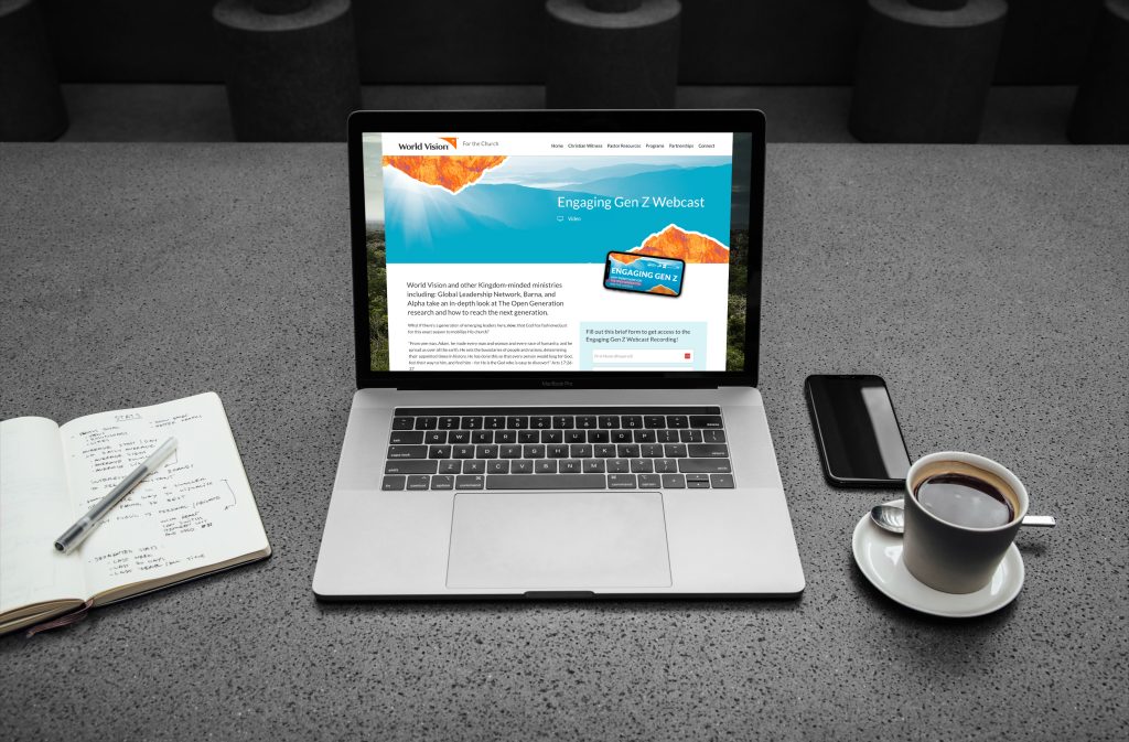
Project Overview: Our Church team sought to provide valuable resources to support pastors in their mission. They had already begun creating these resources but needed a dedicated hub to share them effectively. I was entrusted with the task of designing an end-to-end partner experience resource hub.
Target Personas: Our primary personas for this project were pastors and the advisors within World Vision who serve them. Throughout the project, we prioritized their needs and preferences in all UX decisions.
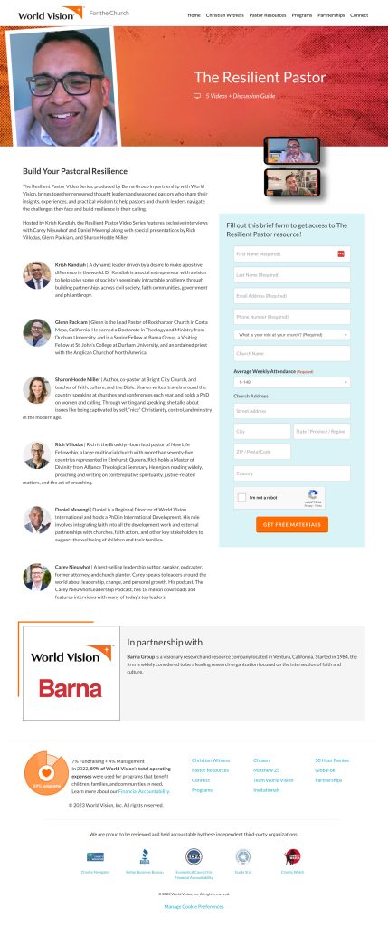
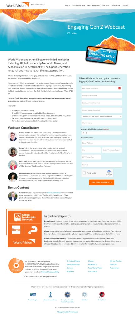
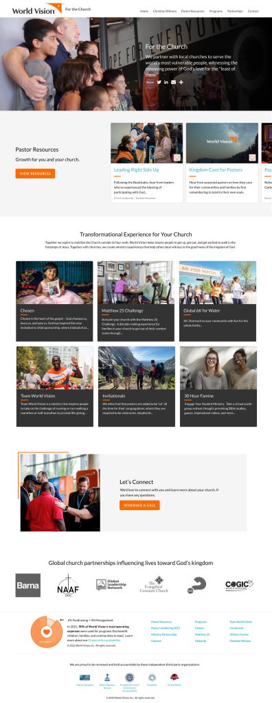
Unique Brand Integration: This microsite marked a significant milestone as it was the first of its kind within the main website. Our goal was to maintain brand consistency while creating a space for the Church team to shine. To achieve this, we implemented unique photo border treatments and pioneered the use of Google Material Design-inspired cards, giving the microsite a distinct visual identity.
Design Process: We initiated the project with wireframes to explore various user flows and information architecture. I presented three initial design compositions for feedback. Upon approval, I transitioned to high-fidelity designs. The initial launch focused on the resource hub, followed by a second iteration to expand the site’s functionality.
Diverse Resource Types: The microsite hosts a wide range of resources, from downloadable PDFs to preordered videos and live webcasts. A key challenge was to create a platform that allowed the Church team to seamlessly add new resources continuously.
Enhancing Accessibility and Findability: While the resources were at the heart of this microsite, we also needed to make various programs for churches more accessible and discoverable. Our design solutions centered around user-friendly navigation and clear program information.
Impact and Results: The results of our efforts speak for themselves. The microsite achieved remarkable conversion rates, with an impressive 48% for the initial webcast, 19% for partner podcasts, and a 25% conversion rate for the prayer guide download. These numbers reflect the success of our user-centered design approach in serving pastors and advisors effectively.
Conclusion: The Church Microsite project was not just about designing a hub; it was about creating a digital space where valuable resources and programs could be easily accessed and appreciated. Our user-centric approach, unique design elements, and iterative process led to outstanding results that met the needs of our target personas and exceeded expectations.
Next Steps: As we continue to support the Church team in their mission, there are opportunities for further enhancements and optimizations to ensure the microsite remains a valuable resource hub for pastors and advisors.
Church Hub - a resource library for pastors
Resource Center for Pastors
Church and Ministry Partners (CaMP)
